Mogo Inc.: MoneyUp Campaign
Introduction
Mogo is a Vancouver-based fintech company that aims to help Canadians control their finances through offering products such as prepaid card, credit score check, identity fraud protection, mortgage, crypto wallet, and loans, with a mission to help Canadians to control their finances.
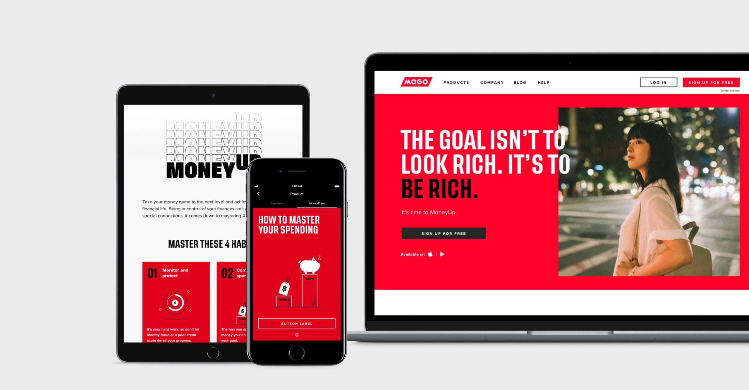
In 2019, mogo wanted to rebrand and focus on four major financial habits to help Canadians be more financially suave: Monitor and protect, control your spending, borrow responsively, and save and invest wisely. While closely working with the design lead, visual designers and copywriter, I re-designed the landing page and product pages on the marketing website, native and web app, and marketing communication to introduce the MoneyUp campaign and educate members.
Role
Product Design
Categories
Marketing website, iOS and Android mobile apps, web app
Year
2018–2020
Requirements
Before the design process began, the stakeholders, design lead, and I met up and set the following requirements:
- Reflecting the new look and feel of the brand to the website and the apps
- Making sure that the 4 financial habits are well-communicated throughout the platforms
- Making sure the information is not overloaded, keeping it simple and easy for the users
Strategies
The messages the business wanted to communicate were exciting, but they could be content-heavy and potentially complicate the overall app experience. To fulfill the requirements, I came up with the strategies below:
- Creating user journeys for onboarding and prepaid card creation flow
- Evaluating the existing apps to find the best ways to showcase the educational information
- Working with the analytics team to understand what’s working/not working on the existing website
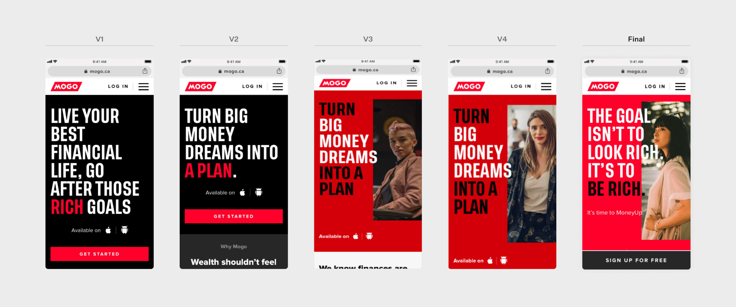
Website Iterations
The first step was to update the marketing website to explain how each of our products can help users achieve their financial goals.
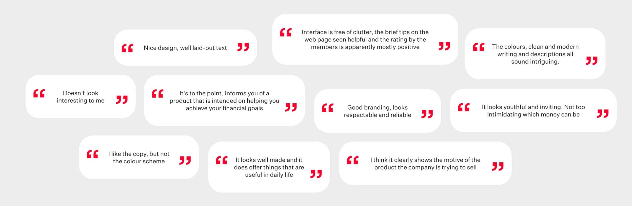
Testing
We ran tests on website designs to answer the following questions:
- Which headline resonates with viewers better?
- What’s the viewer’s first impression?
- Which design works best for the MoneyUp habit section?
Learning
For the first few landing page designs, I received comments that the overall feel of the website was too dark and the product offerings were unclear. I created a few more variations to test and refine the design and messaging. As a result, the participant’s overall impression score increased from 3.30 to 3.90 and we received 80% of positive feedback.
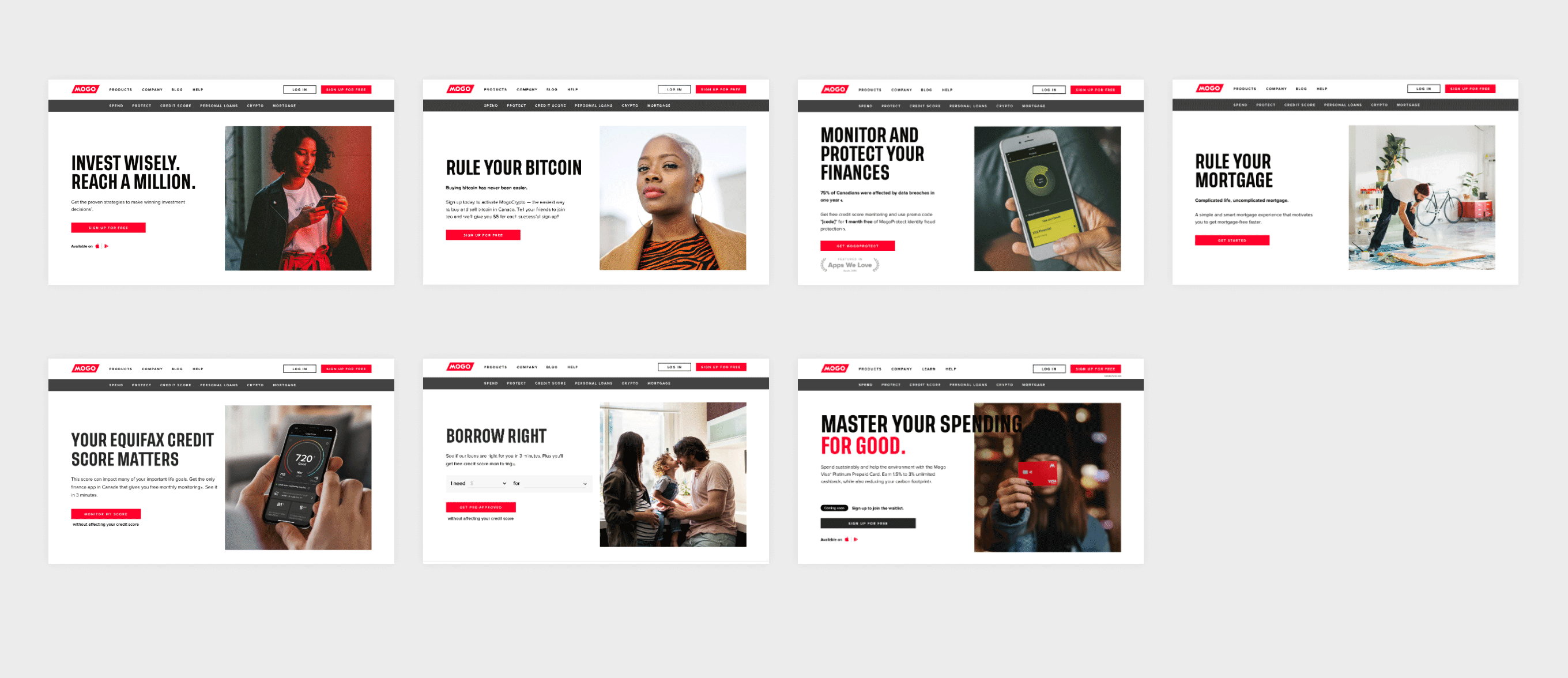
Product Pages
All the product pages were redesigned to reflect the new MoneyUp branding. Here are the snippets of the updated designs:
Web and Mobile Applications
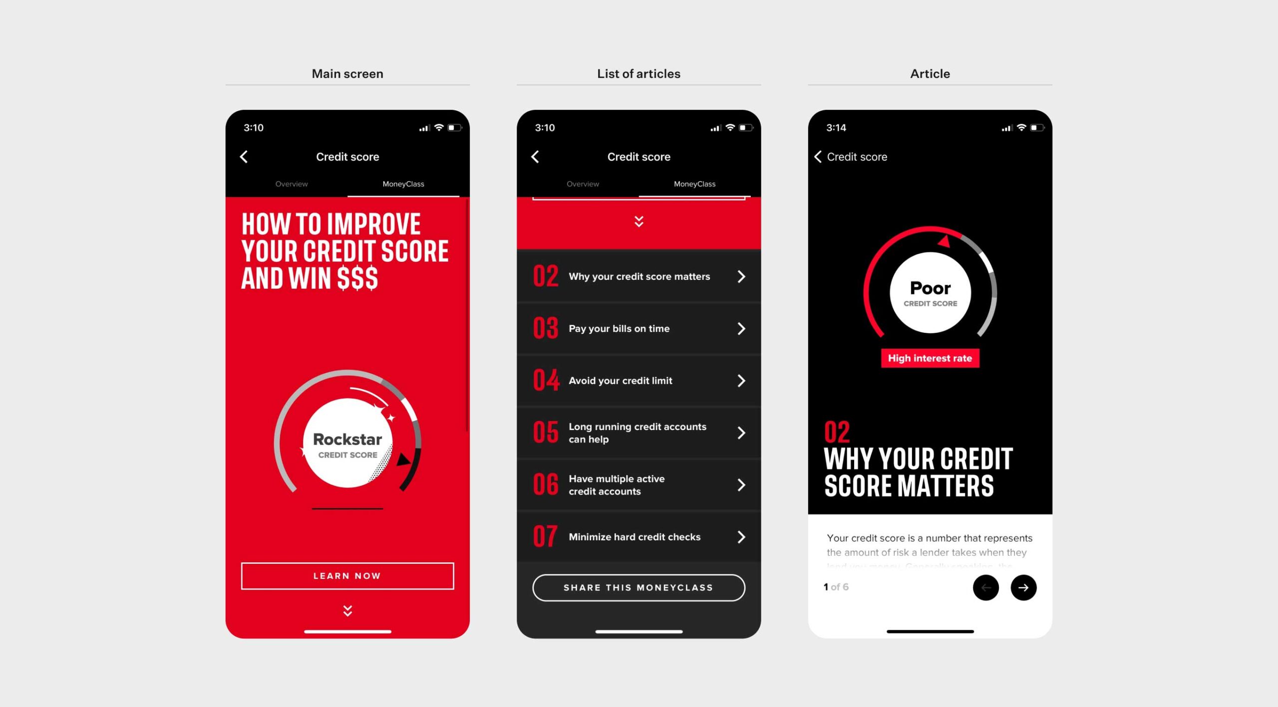
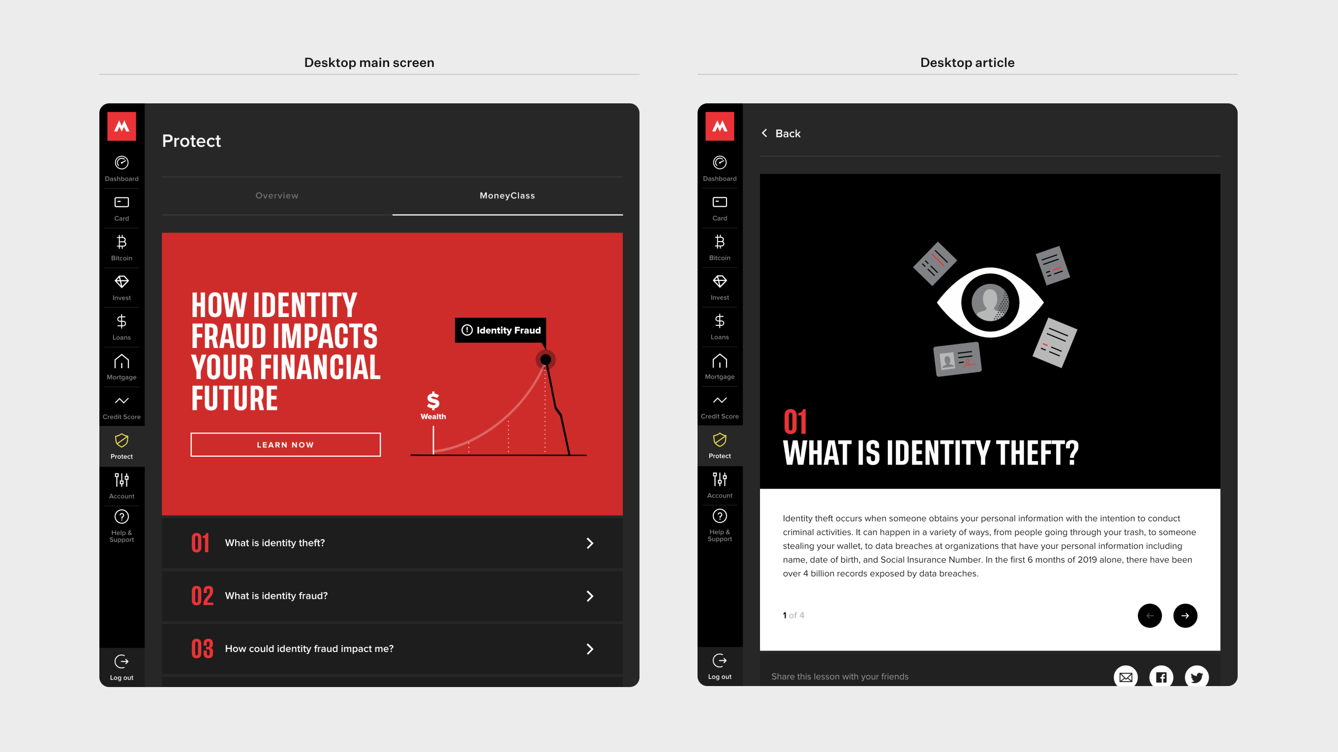
As part of the campaign, Mogo decided to provide educational articles about healthy financial habits. The team decided to call it MoneyClass, offered exclusively to Mogo members.
MoneyClass is available to every Mogo product, easily accessible in mobile and web apps.
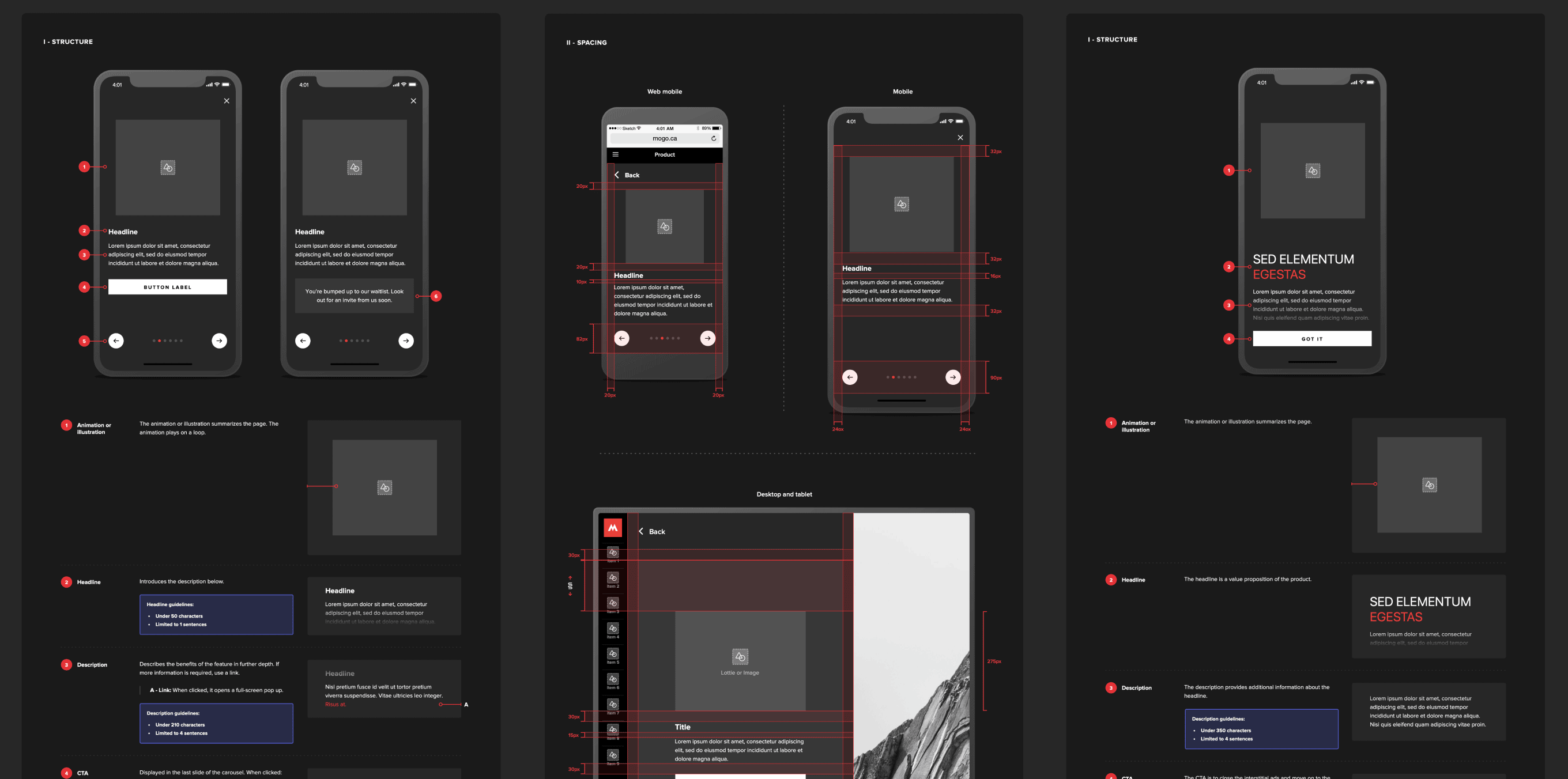
The goal was to make each MoneyClass article informational but straightforward at the same time. To help users understand better, we added fun animations — each conveying what the article is about, which were placed below the headers. For an easy navigating experience throughout the articles, I came up with a fixed navigation bar at the bottom.
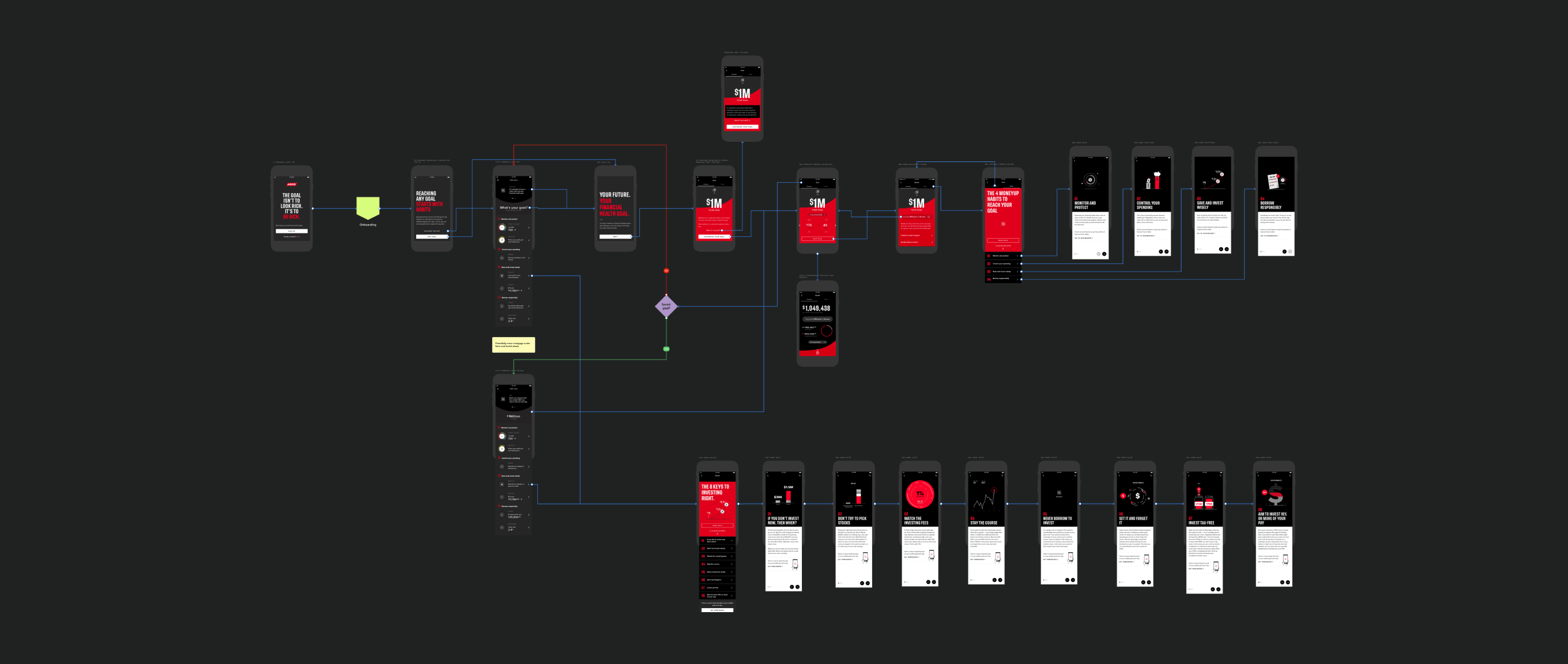
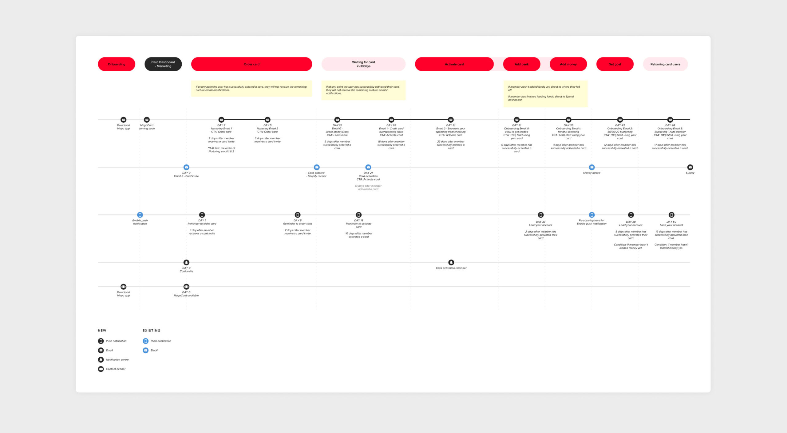
Onboarding and Email Communcation
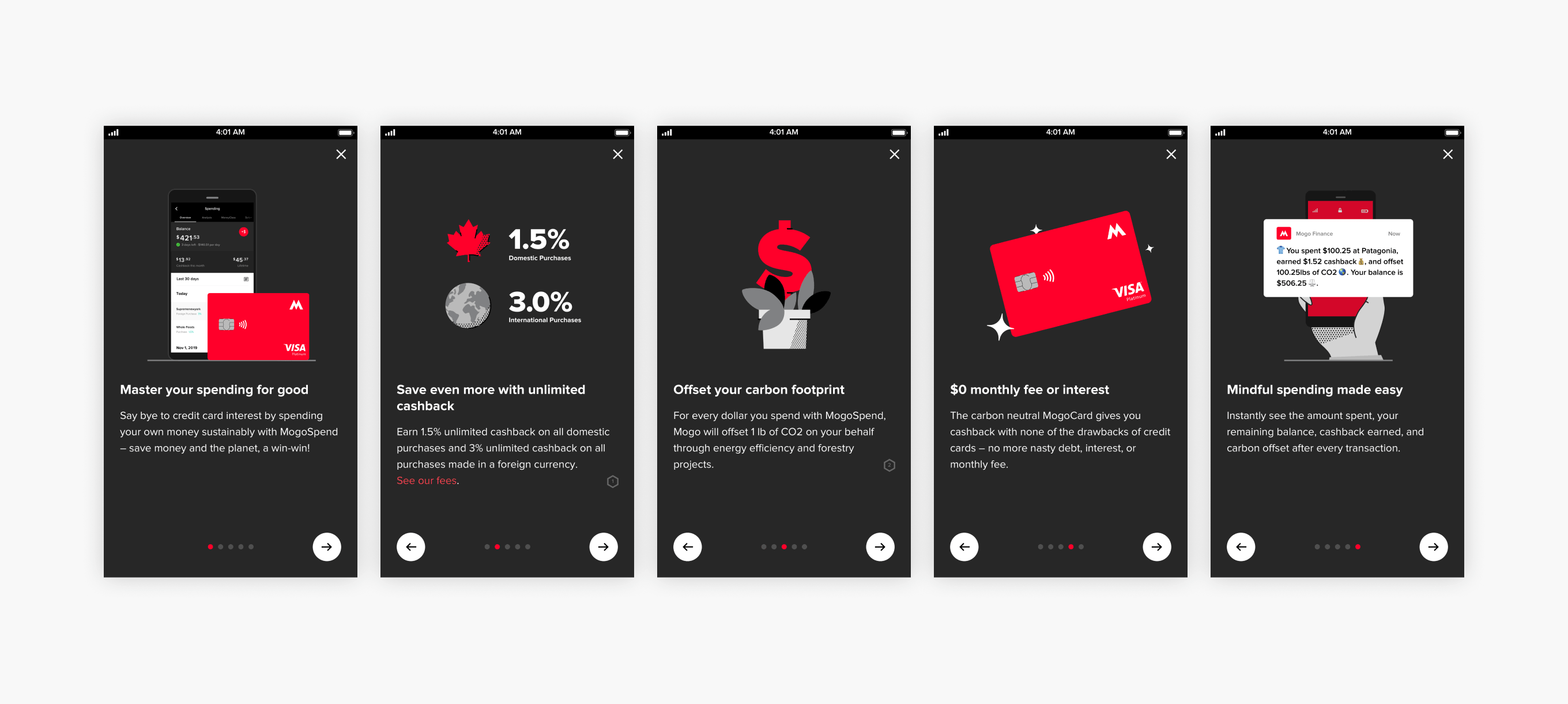
Onboarding
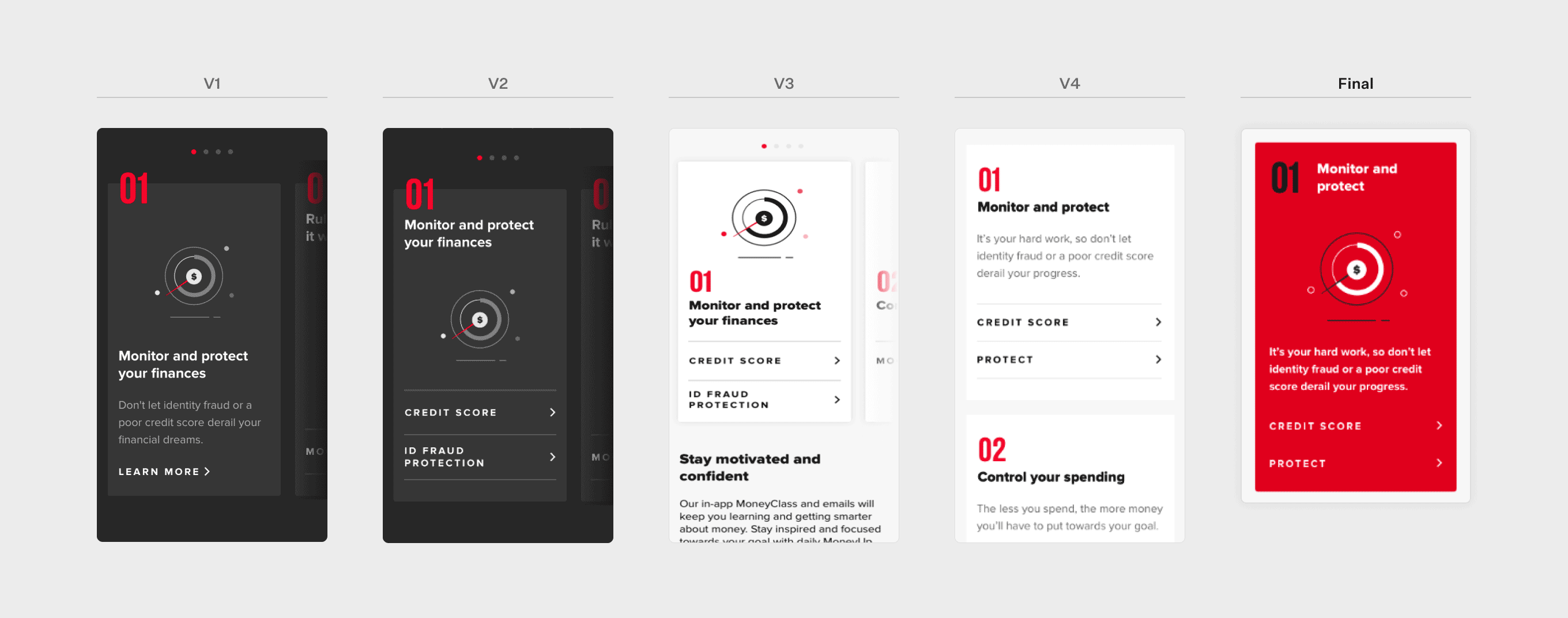
For users who enter the product page for the first time, we’ve decided to show one-time carousel onboarding screens, introducing product offerings in a quick summary.
Marketing Emails
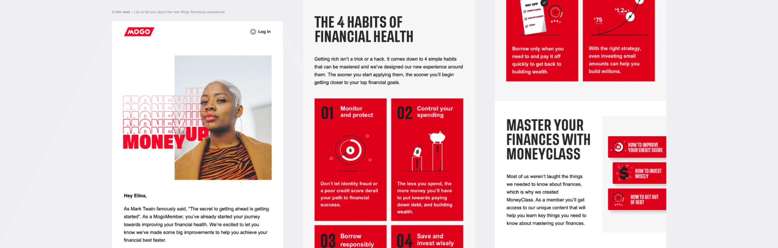
We updated the existing welcome email to introduce 4 MoneyUp habits. We also created a set of emails talking about each habit.
We ran a test on the series of emails and received 100% positive feedback on the emails, scoring 3.8 out of 5 for the usefulness of the information. However, 60% of the test participants said the email length was too long for them.
Here are some snippets of one of the emails:
Design Guideline
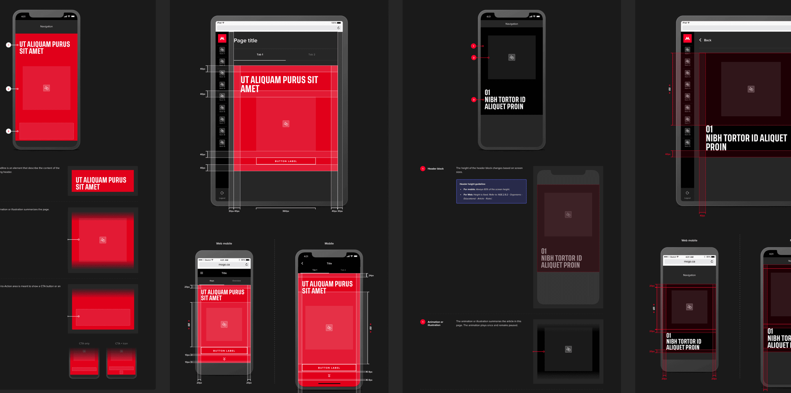
As the last step, all the new designs were made into scalable components and updated in the Mogo design guideline.
Contact
elinataka727@gmail.com